Typography
People in the parks
Year
2024
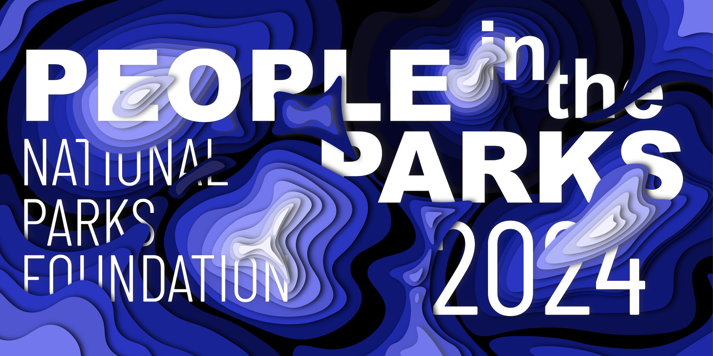
In my Design Systems Class, we were tasked with creating a Cultural Event Triptych (CET) that could be used for an outdoor display. We started the project with a collage mining activity, and with the inspiration images, we chose an organization and event to focus on (the event could be imagined). Because the collage image I chose reminded me of water, nature, and topographic maps, I chose the National Parks Foundation and created the event “People in the Parks” as a conservation fundraiser. I centered my designs around topographic maps, layering, and typography.
Exterior Advertising Campaign
Final Work:
The final triptych came after many iterations, and was a combination of a few of my original sketches. I wanted a layered, cut paper, 3D effect. I created this in Adobe Illustrator and created the mock-ups in LiveSurface.
Process Work:
Inspiration from collage mining
Two Texts
This project focused on the relationship between two texts in both content and design. Each piece was given a different font and throughout the mini-book, the fonts interact to tell a story of how they connect and relate to design.
Typographic Variables
Typography is a powerful tool. It can tell a story that goes beyond the words involved. For this project, we took a Robert Bringhurst quote and used typographic variables to tell a deeper story, one you wouldn’t get from the words alone.
The Light WE Lost Book Cover
A book cover can often be the deciding factor of whether or not someone reads a book. For this project, we redesigned our favorite book’s cover. I chose Jill Santopolo’s The Light We Lost.


