Typography

People in the Parks

Year
2024

In my Design Systems Class, we were tasked with creating a poster series that could be used for an outdoor display. We started the project with a collage mining activity, and with the inspiration images, we chose an organization and event to focus on (the event could be imagined). Because the collage image I chose reminded me of water, nature, and topographic maps, I chose the National Parks Foundation and created the event “People in the Parks” as a conservation fundraiser. I centered my designs around topographic maps, layering, and typography.

Exterior Advertising Campaign
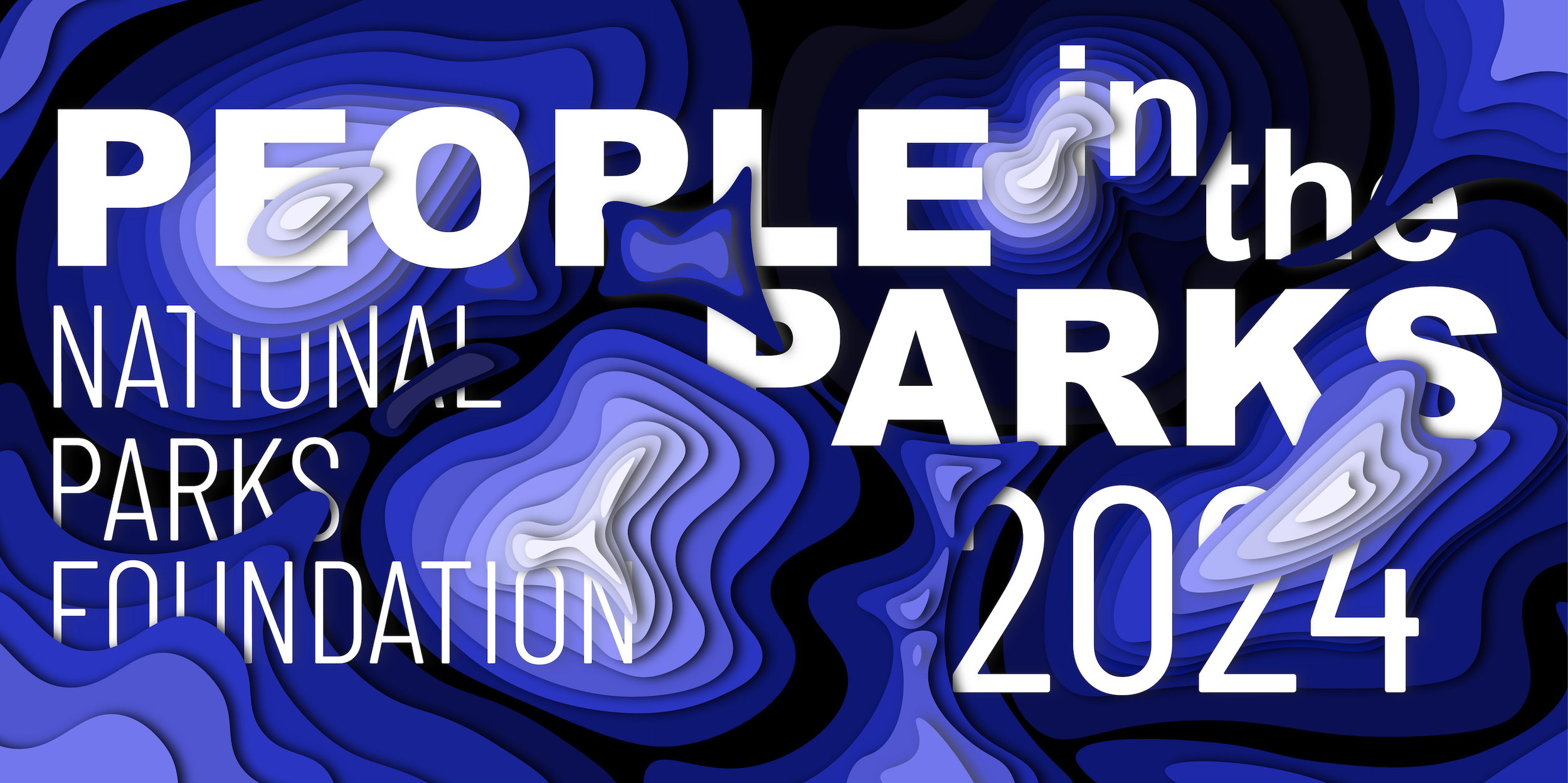
Abstract design with "People in the Parks 2024, National Parks Foundation" text, featuring layered blue topographic patterns.

Final Work:

Layered green paper cut-out design with text "Get People in the Park 2024" and "National Parks Foundation."
Abstract topographic style background with text reading "Keep People in the Parks 2024 National Parks Foundation."
Billboard with "People in the Parks 2024" text and National Parks Foundation logo, featuring blue wave patterns, against a construction site background.
Billboard in front of a brick building with abstract design and text: 'Keep 2024 PEOPLE in the PARKS, National Parks Foundation.'
Billboard with green topographic design and text: "Get People in the Parks 2024. National Parks Foundation." Mounted on a brick building against a blue sky.

The final triptych came after many iterations, and was a combination of a few of my original sketches. I wanted a layered, cut paper, 3D effect. I created this in Adobe Illustrator and created the mock-ups in LiveSurface.

Abstract black wavy lines on a white background

Process Work:

Inspiration from collage mining

A collage of typographic maps featuring topographic designs with varying colors and prints. Includes maps with intricate line patterns, bold color overlays, and text elements. Descriptors on the side: 'TYPOGRAPHIC MAPS', 'OVERLAY PRINT AESTHETIC', 'BOLD COLORS'.
Spiral-bound notebook with grid paper contains sketches and notes for a National Parks Foundation project. The left page has different designs using topographic lines and the phrase "People in the Parks" with annotations like 'fusion' and 'separation.' The right page includes iterations with phrases like "Get People in the Parks" and notes on readability and logo placement. The theme focuses on integrating text with topographic designs.
Abstract topographic design with the text 'Get people in the parks' in bold, overlapping red letters. Right side includes notes on typography using screen printing techniques, and the name 'Emma Woerle' with the number '03.'
Abstract design with topographic contour lines overlaying the text 'People in the Parks.' To the right, it describes 'Swap: tree rings as topography, real topography laid on top,' with the name 'Emma Woerle' and number '04.'"
Abstract paper-cut design with text "People in the Parks." Includes phrases like "Anything goes," "Paper-cut technique," and "Bold, chunky font" alongside "Emma Woerle 05."
Large outdoor billboard with topographic map design and text "People in the Parks," located on a brick building.
Banner reading 'Get People in the Parks - National Parks Foundation' with a topographic map design, hung on scaffolding.
Billboard with "Keep People in the Parks" and "National Parks Foundation" against a topographic background.
Text "People in the Parks 2024 National Parks Foundation" over topographic map background.