


Waylight
MFA Thesis
Visual Communication Design - Rochester Institute of Technology
2025
Role: Sole Designer & Strategist
Responsibilities: UX/UI design, branding, demo reel motion, visual system, and final exhibit.
Tools Used: Figma, Adobe Illustrator, Adobe After Effects, Adobe Photoshop
Mapping the Journey of Faith
-
Mapping the Journey of Faith -
Project Overview
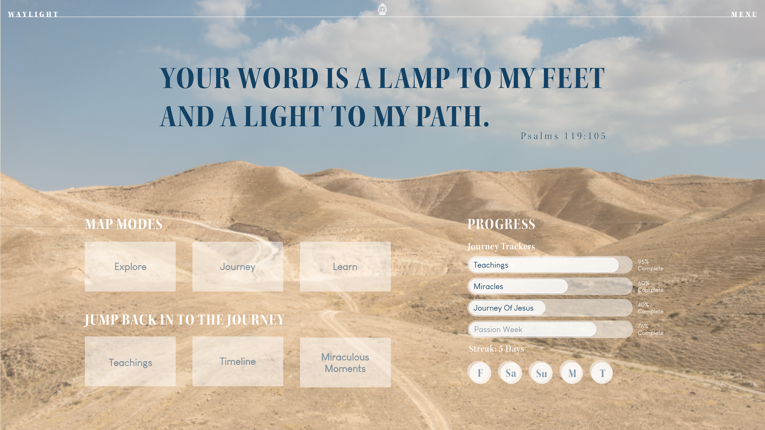
Waylight is an interactive learning platform designed to help users explore the life and teachings of Jesus through an interactive map of ancient Israel.
Rooted in both scriptural accuracy and intentional design, the platform transforms biblical geography from something passive and abstract into a living, navigable journey. Users can select from thematic paths, such as Miracles, Teachings, and Timelines, and follow Jesus’ footsteps from town to town, unlocking key events, verses, and contextual reflections along the way.
The experience is carefully designed to be both spiritually meaningful and visually approachable. Each location pin opens a modular content card with scripture, historical insight, and layered meaning. Rather than overwhelming users with dense text or theological jargon, Waylight invites them into discovery, allowing space for curiosity, clarity, and reverence to coexist.
Created as part of a graduate thesis project, Waylight is more than a prototype, it’s a vision for how digital tools can support faith-based learning in a modern world. The map, brand, and UI system work together to offer a new way of engaging with the Bible: not just by reading it, but by visually walking through it.
Problem Statement
How can we create a spatially driven digital experience that helps modern learners connect the life of Jesus to its geographic context, while also balancing theological depth with visual clarity and usability?
Biblical geography is often presented through static maps or dense text, making it difficult for modern audiences, especially visual and digital learners, to grasp the physical context of Scripture. There is a lack of accessible, spatially-driven tools that help users connect the life of Jesus to the places where His ministry unfolded.
Additionally, few digital experiences balance theological reverence with intuitive UX design. The challenge was to create an interface that felt spiritually grounded, visually clear, and emotionally engaging without oversimplifying or overwhelming the content.


Objectives and Solutions
-
“Biblical learning tools are text-heavy, outdated, or intimidating for new users.”
Solution:
Waylight replaces long blocks of scripture with spatial storytelling. Users interact with a clean 2D map where events are location-based. Each site opens a brief, digestible card featuring scripture excerpts, narrative context, and optional toggles for deeper insight. The UI uses whitespace, clear hierarchy, and simple navigation to reduce overwhelm.
-
“It’s hard to understand how different events in Jesus’ life connect across geography.”
Solution:
Waylight introduces curated journeys, like Miracles and Teachings, hat string together related events across multiple places. This thematic structure reveals movement and meaning, helping users track narrative arcs spatially. Highlighted paths animate across the map, giving users a clear visual flow of where and why things happened.
The Map: Modernizing Resources
At the core of Waylight is a spatial learning experience that brings scripture to life through geography. Instead of presenting text-heavy passages, the platform invites users to explore a clean, stylized 2D map of ancient Israel. Each location reveals a modular content card containing scripture, story summaries, and optional layers of historical and theological insight. The interface prioritizes simplicity—using thoughtful whitespace, a clear visual hierarchy, and intuitive navigation to foster focus and reflection.
The map itself was originally crafted in Illustrator, drawing on topographic references to create a symbolic landscape. It was then brought into Figma, where interactive elements, location markers, and journey paths were layered in to support the platform’s narrative structure and UX flow.
Process
Topographic Reference
I began by referencing colored elevation imagery of Israel to interpret major landforms. This guided the simplified vector landmass, water bodies, and terrain zones created in Illustrator.Historical Accuracy
City placements were informed by multiple historical and scriptural maps. These helped ensure that journey paths and event locations aligned with both biblical text and archaeological understanding.Figma for Labels + Interaction
All labels, markers, and interaction points were added in Figma to ensure alignment with the UI system. Each clickable location ties directly to a curated scripture set, allowing users to explore Jesus’ ministry both visually and thematically.
Outcome: A clean, modernized spiritual map: visually intuitive, historically grounded, and built for exploratory learning.


Primary Reference
Other Map References


First draft

Desired changes:
Softer transitions between elevations
Cooler color palette
Increased detail
Final Map
Explore the Path of Christ

Journeys: Contextualizing Scripture
Guided paths through specific locations, themes, and timelines of Jesus’ ministries.
To help users understand the broader story of Jesus’ ministry, not just as isolated events, but as a connected movement across time and place, Waylight introduces curated journeys. Each journey, such as Miracles, Final Days, or Teachings, groups related events and locations into a thematic path. These sequences create narrative clarity by revealing how Jesus’ actions unfolded geographically.
Teachings of Jesus Journey
Journey Design Process
Learn - Explore - Journey overview
Each journey in Waylight was built to offer a narrative thread through geography, grouping events by theme to help users trace Jesus’ ministry in context.
Content Curation
I categorized key events into themes like Miracles, Teachings, Encounters, and Final Days. These categories were informed by scripture, then cross-referenced with academic timelines and biblical scholarship to ensure narrative and theological coherence. Finally, with the support of ChatGPT, I created the copy for the journeys (see Conclusion and Future Vision).Spatial Mapping
Using historical maps and gospel sequences, I plotted each event to a physical location on the 2D map. This allowed each journey to unfold as a visual path, reinforcing Jesus’ movement through Israel and the surrounding regions.Figma Integration
In Figma, I created clickable overlays for each journey, with highlighted paths and interactive location pins. Each selection opens a modular content card with scripture, summary, and optional contextual layers, keeping the user focused while gently guiding their exploration.
Outcome: A clear, theme-based system that transforms fragmented stories into connected, map-based spiritual journeys: simple to navigate, powerful in meaning.
By animating paths across the map and highlighting stops along the way, the platform allows users to visually trace each story arc. This approach transforms scattered scripture references into structured experiences, making it easier to follow the purpose, pacing, and progression of Jesus’ life through space.
This redesign centers place and passage, inviting curiosity and exploration, especially for newer audiences or those unfamiliar with the geography of the Bible.
Existing tools prioritized either reading or maps, but not both.
User Flows
Journey Flow: Select Journey → Highlighted path appears → Click first location → View content → Proceed → Complete Journey → Start new Journey
Location Flow: Click map pin → Open content card → Toggle info layers (if applicable) → Read Full chapter → Save or share → Exit Content Card
Future Feature: Save journey progress or bookmark verses

Challenges
-
I focused on tone through type, color, and copywriting. Instead of overt religious language, I used gentle prompts like “Trace His Steps” or “Begin the Journey.” The UI avoids devotional language, letting scripture speak for itself while the design cues invite reflection. The lantern logo and soft palette signal spiritual themes without dogma.
-
I synthesized content from multiple biblical and archaeological sources, then distilled the map and journeys to essential moments. Locations were cross-referenced with scripture and placed logically on the map, but I removed excessive data points to keep the interface digestible. Key: letting clarity guide fidelity.
-
The map’s visual language set the tone for the entire platform, so nailing it was critical. I explored a wide range of styles: textured 3D landscapes, minimalist flat shapes, satellite overlays, vibrant color systems, and monochrome palettes. None struck the right balance between reverence, clarity, and warmth.
What finally worked was a 2D vector system styled to feel like layered wood or paper cutouts, subtle, tactile, and symbolic. The aesthetic nods to Bible paper and the craft of carpentry, directly referencing Jesus’ identity as a carpenter. This grounded, human quality became the design foundation for the entire UI: soft, layered, and sacred without being ornate.
System Design
The Waylight brand is designed to feel reverent, modern, and quietly confident, reflecting the tone of the platform itself. Every visual choice was made to support spiritual clarity, user trust, and exploratory learning.
Typography
Display Font: Kepler Semibold Semicondensed
Chosen for its classical elegance, Kepler adds a grounded, almost scriptural feel to headlines and titles. Its condensed form gives strength without heaviness, ideal for the lantern word mark and section titles throughout the UI.Body Font: Louis George Café (Light, Regular, Bold)
Simple, approachable, and highly legible, this sans serif serves as the functional backbone for UI elements and body content. Its soft geometry pairs well with the serif display, creating a modern yet thoughtful balance.

Iconography
The custom icon set balances minimalism with metaphor. Line-based and rounded, each icon is easily readable at small sizes while conveying deeper meaning.
Core Icons Include:
Map, compass, scroll, temple, group, book, cross, and location pin
Map-specific icons:
Designed with subtle layering and directionality in mind, including a stylized compass rose and multi-layer toggle.

Color System
The palette draws from both the natural terrain of Israel and symbolic Christian elements: desert tones, sea blues, olive greens, and aged parchment whites.
Primary Colors:
Deep Slate Blue – directional, calming
Olive Green – grounded, organic
Gold/Bronze – hints at sacredness and divinity
Neutrals:
A spectrum of creams, grays, and blacks ensures ample flexibility for layering, contrast, and accessibility.
The full color system is designed to work equally well on screen and in print, with accessible contrast levels and a natural, lived-in tone.

Logo Concept
The Waylight logo is a stylized lantern, symbolizing light, guidance, and sacred journey. At its center is a map pin, reinforcing location as the core storytelling device. The lantern form is symmetrical, balanced, and open, inviting users in.
The design is a visual metaphor drawn from Psalm 119:105:
“Your word is a lamp to my feet and a light to my path.”Rendered in the brand’s parchment neutral tone and slate blue, the logo can sit comfortably on light or dark backgrounds. The logotype uses Kepler to tie back into the broader system and suggest a timeless, almost engraved quality.

Design Principles Behind the System
Consistency and Cohesion
Colors, type, and interaction patterns are repeated consistently across screens to create a cohesive system. This visual rhythm reinforces user confidence and reinforces brand recognition while supporting smooth, uninterrupted navigation.
Balance and Simplicity
The layout uses balanced composition with consistent margins, grid alignment, and intentional whitespace. These decisions reduce cognitive load and allow the user to focus on narrative and geography without distraction. Simplicity in iconography and interface design supports intuitive navigation and calm interaction pacing.
Clarity and Information Access
Waylight is built for clarity and ease of use. High-contrast text, generous spacing, and accessible typography support comfortable reading across all devices. Minimal motion and intuitive layouts guide users of all backgrounds through the content without distraction. This focus on clarity was essential to make biblical exploration approachable for users with varying levels of digital and scriptural literacy.
Visual Hierarchy
Waylight applies clear typographic and spatial hierarchy to guide users through content with intention. Headings, body text, and UI elements are scaled and spaced to support easy scanning and comprehension. Important information is emphasized through size, contrast, and position rather than decoration.
Tone and Symbolism
Rather than relying on literal or overly stylized religious imagery, the design embraces abstract symbolism. Visual references like layered paper, soft shadows, and hand-drawn textures evoke warmth and sacredness without prescribing belief. This approach allows for spiritual engagement while honoring a range of user perspectives

Design Interations
The Process
Waylight began as a gut instinct, one of the very first concepts I sketched for my thesis. From the start, I knew I wanted to create something spatial, visual, and rooted in scripture. But getting the visual system to feel right took time and a lot of letting go.
Early Direction: “Ministry Mapper” and 3D Terrain
The initial iterations of this project, originally titled Ministry Mapper, lacked visual cohesion and depth. The interface relied on bright colors, generic icons, and a layout that felt more like a children’s app than a tool for meaningful biblical exploration. While the tone was playful, it didn’t align with the level of complexity or thoughtfulness I intended for the experience.
At the same time, I explored a fully rendered 3D terrain, aiming to create a sense of sophistication and immersion. Using Cinema 4D, I built landscapes with satellite-inspired textures and elevation-based lighting to root the design in realism. However, as the map developed, it began to feel too much like a video game. The environment was visually dense and distracting, making it harder for users to focus on Scripture or follow the narrative. Instead of enhancing the experience, the 3D visuals made it more difficult to engage with the core content.
This turning point led me to reevaluate the project’s foundation.
The Pivot: Letting Go of 3D
The breakthrough came when I stepped away from the 3D concept and returned to the basics. I stripped the interface down and began rebuilding it using clean 2D vector graphics. Inspired by the texture of Bible paper and the tradition of carpentry, I developed a terrain style that resembled layered paper cutouts. This new direction felt tactile, symbolic, and visually calm.
With this shift, everything began to align. The colors became more grounded, the typography gained structure, and the interface finally had room to focus on clarity. Rather than weakening the system, simplifying it made it stronger.
Evolving the Visual Style
Once I let go of the 3D direction, I focused on refining the visual language of the platform. The early designs lacked warmth, depth, and a sense of cohesion. I wanted something that felt more sophisticated but still welcoming and intuitive for users of all ages.
I created a more neutral and natural color palette and paired serif and sans-serif fonts to bring contrast and hierarchy. The updated design drew on tactile references like parchment, printed Bibles, and traditional maps, but remained clean and modern. Iconography and UI elements were softened and simplified to support calm interaction and legibility.
This approach brought a better sense of balance. The platform could now hold the spiritual and educational weight of the content without becoming overwhelming or clinical. It felt both grounded and inviting, and it supported a wide spectrum of users.
Bringing it Together
By the time I designed the journey feature, the system felt cohesive and complete. The user interface now supported spatial exploration, narrative clarity, and thematic learning in a way the early designs could not. What began as a process of experimentation and misalignment ultimately became a focused and thoughtful solution rooted in simplicity and intentional design.
First Iterations


Second Iterations


Final Design


Logo Design Process


Imagine RIT
As part of the final phase of my thesis, I exhibited Waylight at Imagine RIT, a campus-wide showcase of innovation, creativity, and research. My display served as both a visual introduction to the platform and a tangible expression of the tone and intent behind the project.
The booth featured a looping demo reel to simulate user interaction. Branded elements including stickers, posters, and lanterns around the booth echoed the theme of light as guidance. Visitors could explore curated scripture journeys, examine map prints, and engage in conversation about the intersection of faith and design.
Presenting at Imagine RIT gave me the opportunity to test the clarity, accessibility, and visual impact of Waylight in a live environment. Seeing people pause, interact, and reflect confirmed the value of using design as a tool for spiritual education and exploration. It was a meaningful conclusion to a project rooted in both narrative and navigation.


Conclusion & Future Vision
Waylight
Emma Woerle
2025
Waylight set out to solve a clear problem: how to make the geography of Jesus’ ministry, and the broader narrative of the Bible, more accessible, visual, and spiritually engaging for a modern audience. By combining interactive UI design with narrative structure, spatial mapping, and a carefully curated brand system, the project reimagines how Scripture can be experienced digitally.
Key Takeaways
At its core, Waylight transforms passive Bible reading into active exploration. It offers users a clear, thematic pathway through Scripture, organized not just by verse, but by place and story. From the clean, vector-based map to the modular content cards and brand voice, every design choice reinforces a tone of gentle guidance, clarity, and depth.
Outcomes & Impact
While still a prototype, Waylight was exhibited publicly at Imagine RIT and resonated strongly with a wide range of users, from curious children to educators and faith leaders. It demonstrated that design can be a powerful tool for spiritual education when paired with thoughtful research and restrained aesthetics.
Strengths & Weaknesses
One of the project’s biggest strengths was its cohesion: map, motion, UI, and brand all speak the same language. The pivot away from 3D and toward paper-cut vector styling unlocked the clarity and warmth the platform needed. However, the absence of a coded prototype limited real-time user interaction, and content development was constrained by the limits of solo authorship.
Lessons Learned
Designing for sacred content requires a unique balance of precision, restraint, and empathy. I learned that visual sophistication doesn’t have to come from complexity. it often comes from subtraction. I also realized the power of tone as a UX tool, especially in spaces where spiritual, emotional, and historical content intersect.
Looking Ahead
Looking ahead, I envision Waylight expanding into a full-scale educational platform that spans the entire Bible. Future iterations could include reflection questions, study guides, quizzes, and devotionals, created by a team of theologians, pastors, historians, and educators. While artificial intelligence was used during prototyping, the final version would require human-authored content to maintain theological accuracy and cultural sensitivity.
Ultimately, Waylight contributes to the field of visual communication design by showing how digital tools can be used to translate ancient narratives into accessible, interactive learning experiences, honoring both form and faith.
References
"Bible Maps: Navigate Your Way Through Scripture." Bible Study Tips. Accessed December 5, 2024. https://biblestudy.tips/bible-maps/.
"Chronology of Jesus’ Life and Ministry." UnderstandChristianity.com. Accessed January 14, 2025. https://www.understandchristianity.com/timelines/chronology-jesus-life-ministry/.
"Integrating Technology into Small Group Bible Studies: A New Age Approach." U.S. Seminary for Theological Studies. Accessed February 12, 2025. https://usseminary.com/integrating-technology-into-small-group-bible-studies-a-new-age-approach/.
“Israel Topographic Map, Elevation, Terrain.” Topographic-Map.com. Accessed March 15, 2025. https://en-us.topographic-map.com/map-62dnh/Israel/.
"Jesus Starts His Ministry." The Bible Journey. Accessed October 3, 2024. https://www.thebiblejourney.org/biblejourney1/4-jesuss-journeys-around-galilee33795/jesus-starts-his-ministry/.
Meier, John P. "Map of the Galilee of Jesus’ Ministry." In A Marginal Jew: Rethinking the Historical Jesus, Volume 4: Law and Love, 665. New Haven: Yale University Press, 2009. http://www.jstor.org/stable/j.ctt5vkwvw.13 .
Phillips, J. B. Travels and Acts of Jesus. Christian Classics Ethereal Library. Accessed September 25, 2024. https://www.ccel.org/bible/phillips/CN160-TRAVELS.htm .
"She Reads Truth Bible." Christian Standard Bible. Accessed November 11, 2024. https://shereadstruthbible.csbible.com/.
"Travel Maps from the Life of Jesus." BT Stories. Accessed March 4, 2025. https://www.btstories.com/wp-content/uploads/Life-of-Jesus-Travel-Maps.pdf.
Van Wolde, Ellen. Reframing Biblical Studies: When Language and Text Meet Culture, Cognition, and Context. University Park, PA: Pennsylvania State University Press, 2009. Accessed May 3, 2025. ProQuest Ebook Central.
Wright, Paul. Rose Then and Now Bible Map Atlas: With Biblical Background and Culture. 1st ed. Carol Stream, IL: Tyndale House Publishers, 2013.
Video content from Pexels.com - Edgaras Mascinskas, Samir Smier, and Tima Miroshnichenko
Stock templates and images from Adobe Stock
Music from YouTube studio - “A Distant Call” - Dan Lebowitz, Tone Seeker